BACK In black

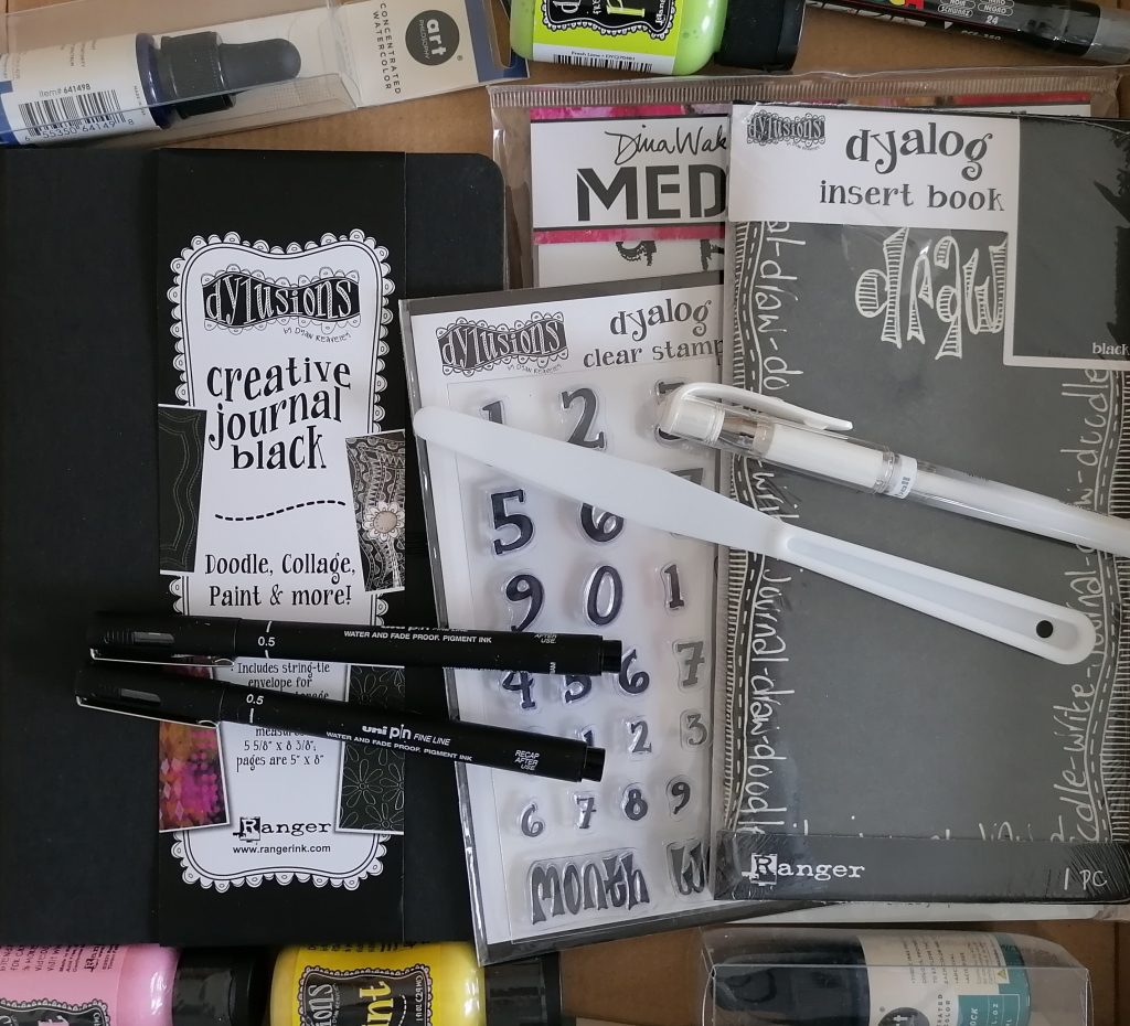
Always looking for a new challenge and something to keep my journaling from becoming stale, I was super excited when Clare from Paper Pen and Plan sent me a couple of black journals to try out and see what I think.

Both are from Dylusions and have thick pages making them both great for any mixed media work.
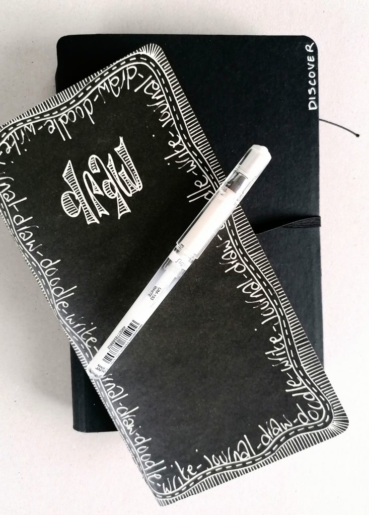
The challenge is how to fill them and which mediums work best over the dark background paper. It’s surprisingly not as difficult as you might think and the black really does make most paints shine on top.

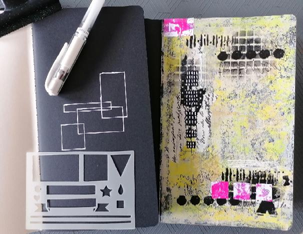
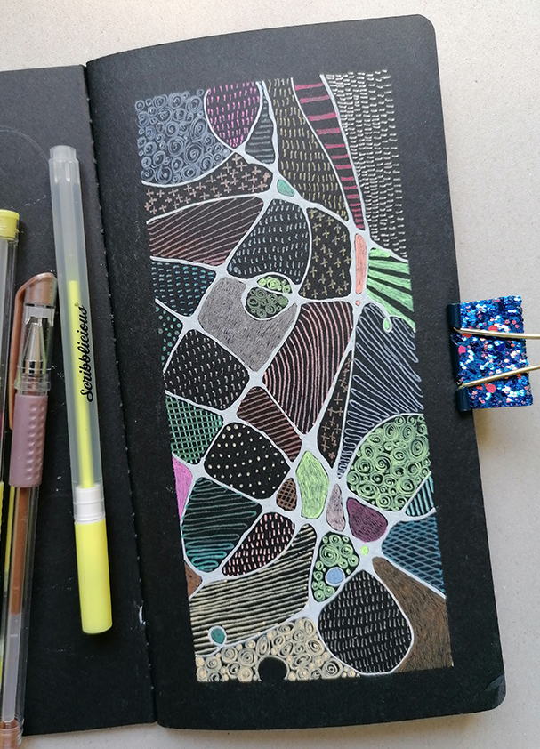
The smaller travelers notebook style journal I decided to use as a doodling notebook, experimenting with different pens on the black pages. The second and bigger of the journals I’m treating as any other journal and loving how it’s working out.
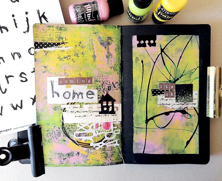
I thought adding a border would make it look neater but actually the page is too narrow for that and the artwork just looked a bit squashed. The only way to make the border work is by creating a double page spread, so that’s exactly what I did here. I have to admit though to going back around the edge with black gesso once I’d pulled off the tape. For some reason I want to keep the black journal clean. A double page spread is definitely the better way to go.
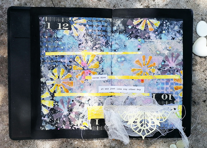
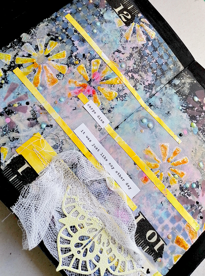
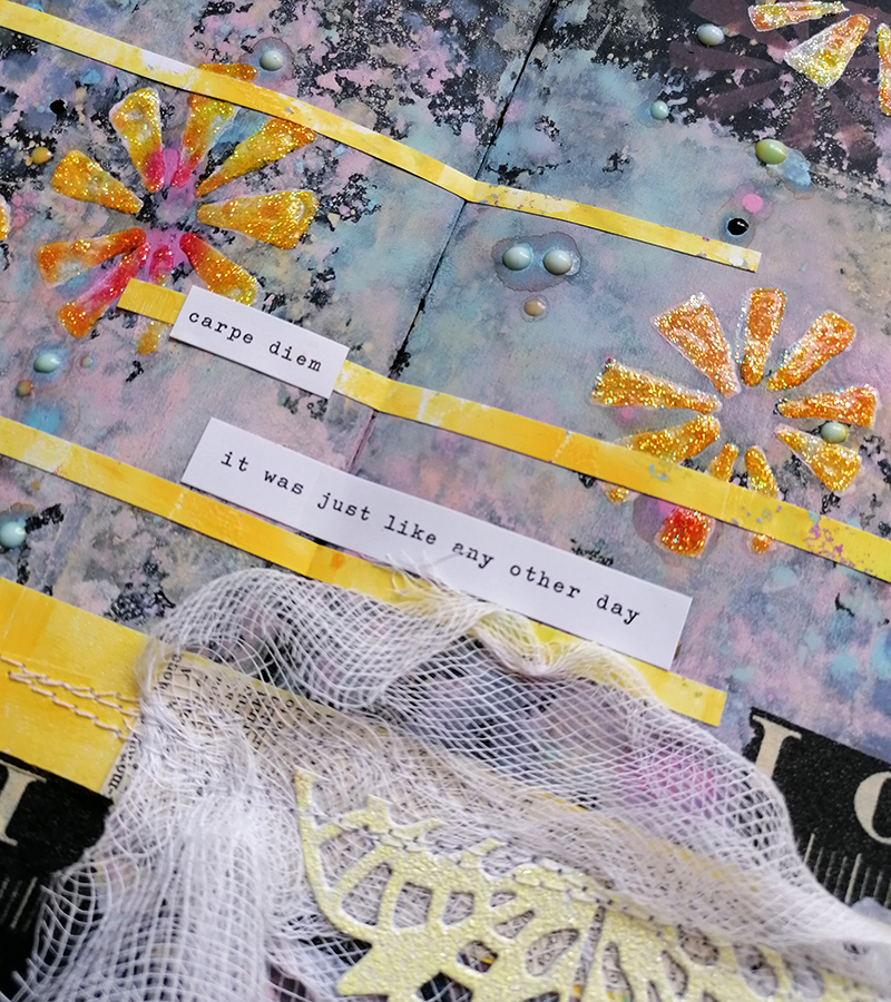
The little collage was pre sewn before being stuck down to the page and adding a bit of black washi tape is an unexpected addition. So far I’ve been using acrylic paints on the pages so I thought I’d try something else. Distress Oxide inks are a bit different and work well on dark backgrounds. I used both the reinkers and the ink pads but found the ink pads got a bit lost. The page needed lifting somewhat so I added some stenciling with white gesso which I also went back over with Stickles.
The doodling journal is much cleaner, fits nicely in my bag with a couple of pens and looks neat with stencils too. These are the stencils I designed for Paper Pen and Plan to go with the Sweet Treat boxes, I love them.
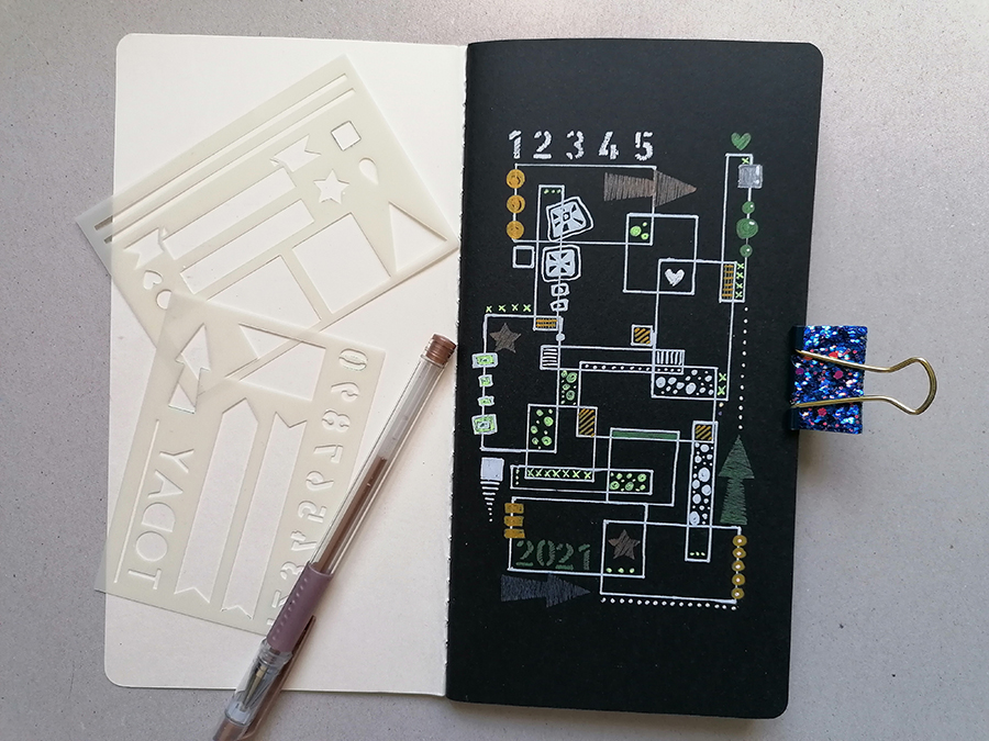
Gel pens, especially metallic ones look fab on a black background, and a white Posca pen goes brilliantly around the edges of the design.
I enjoy using the black journals for a change and discovering which mediums work best on the pages.

The black Dylusions journals can be found at Paper Pen and Plan on Etsy

Have a lovely week

Jaine xxxx

my journal inspiration

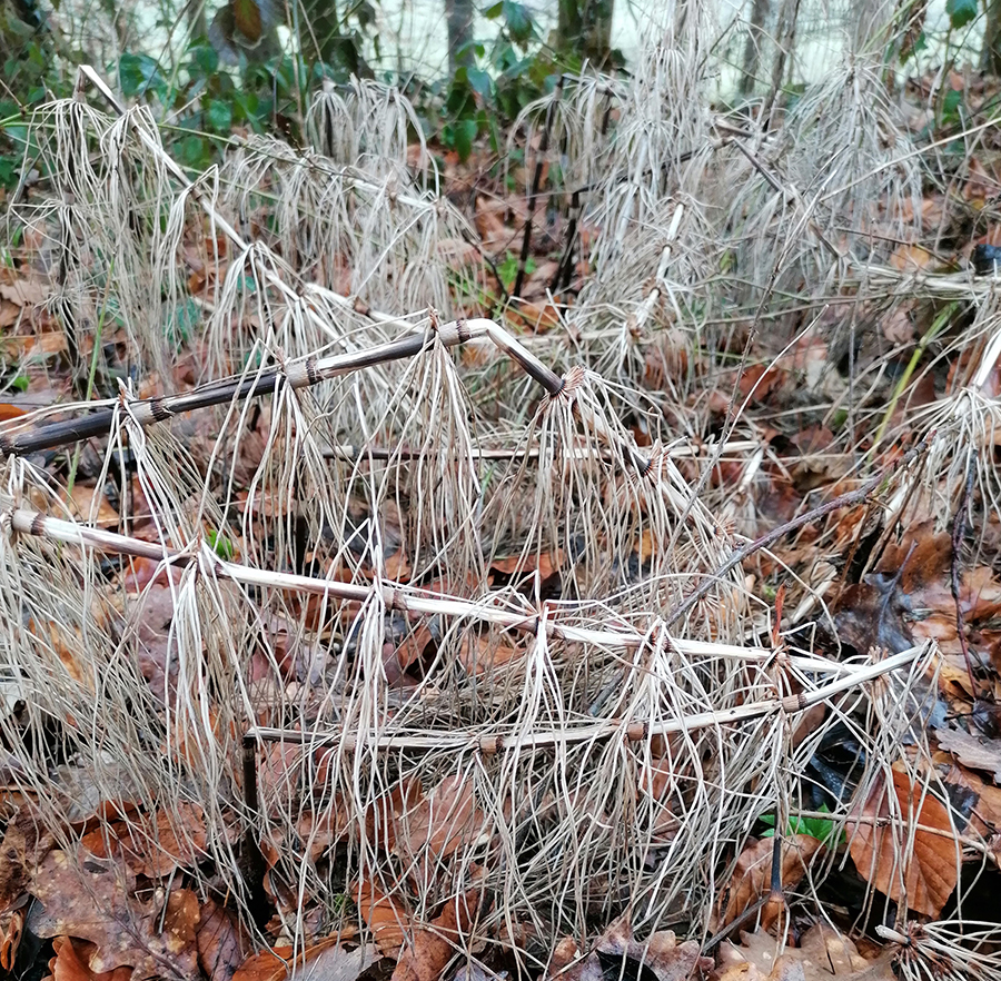
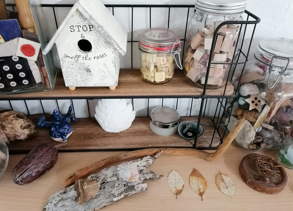
I think in a previous life I must have been a magpie or something because rarely do I come home from a walk without a few leaves, a stone, bit of rusty metal or stick in my pocket. I may be a little obsessive about it even to the point where I carry a little bag with me just for that purpose!

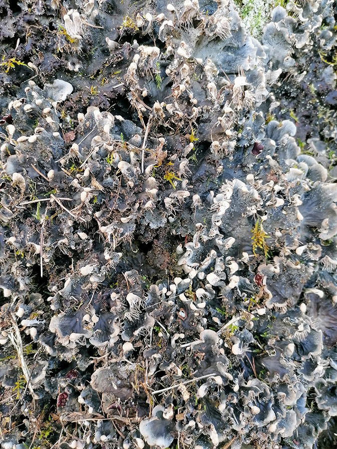
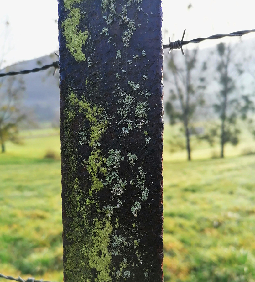
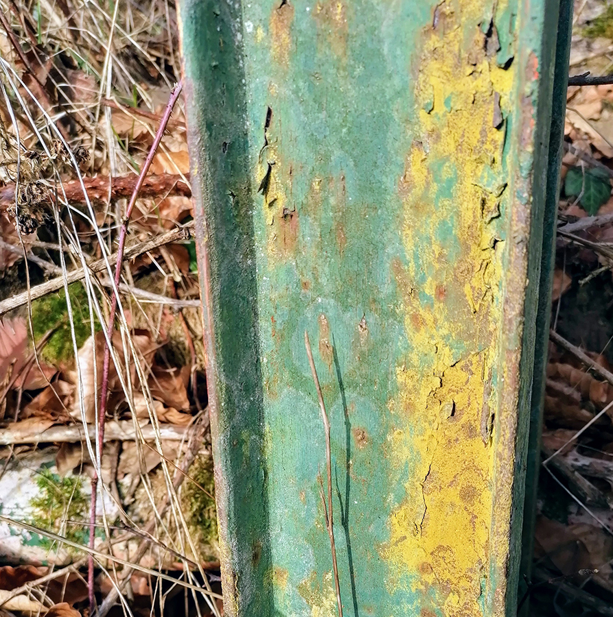
These things usually end up on my inspiration shelf until a time when I might use them in some project. Alot of the time I might photograph them or scan them into the computer to keep as collage images, especially if they’re fragile like leaves or obviously bulky like wood. I take lots and lots of photos when I’m out too, mainly of trees and things from the forest floor, or like here, mosses or rusty posts.

All of these things can become colour schemes or shapes and patterns.

I use these as inspiration for colours or themes in my journals and sketchbooks.

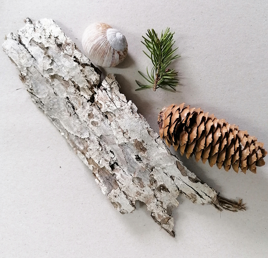
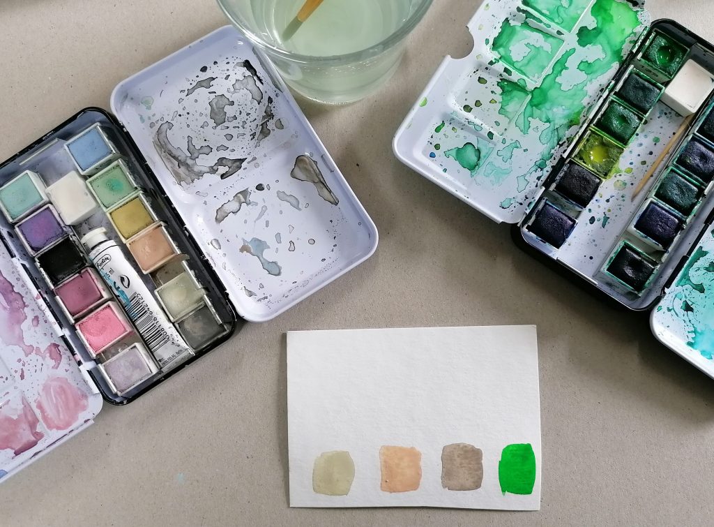
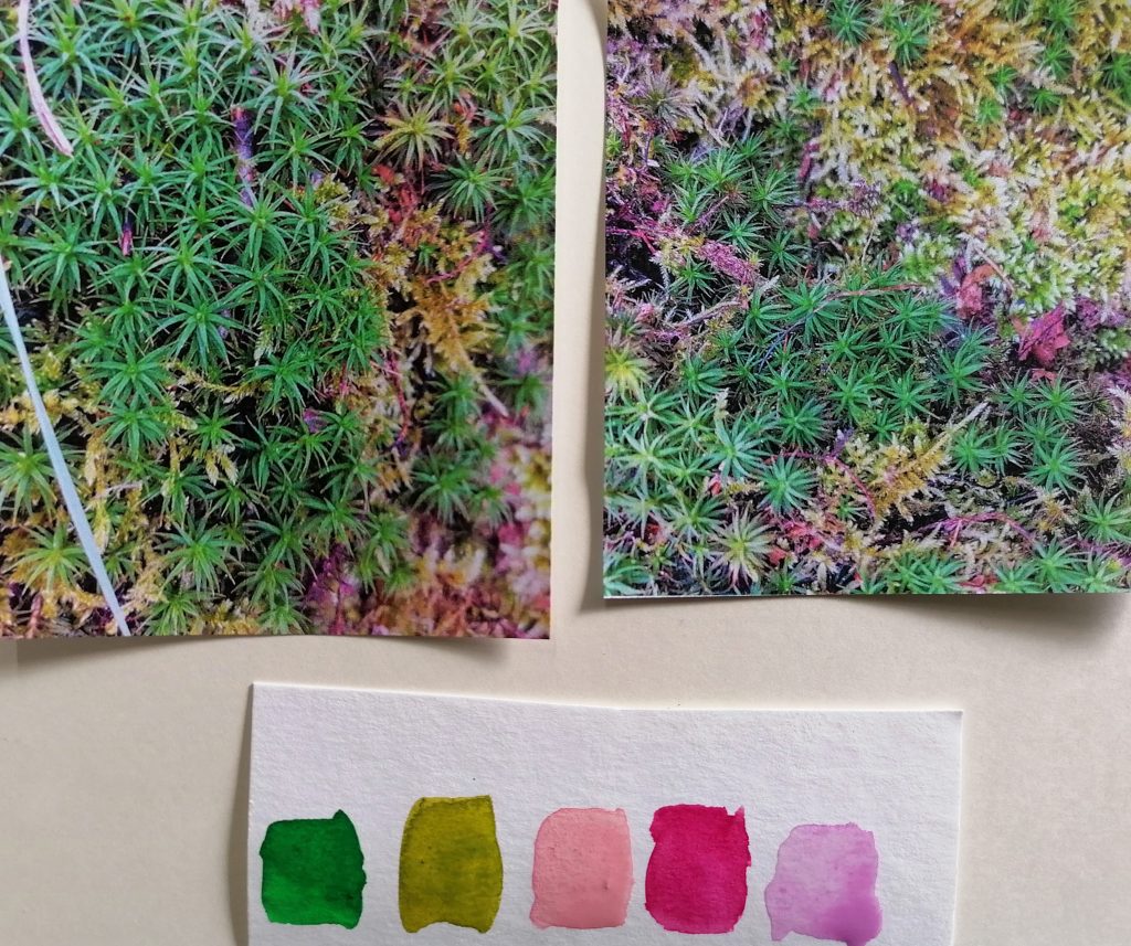
For example, I took the little collection above and created a colour palette with my watercolours.

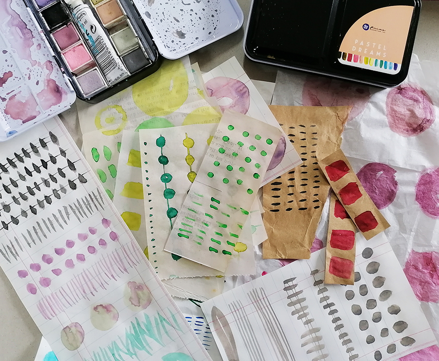
Another thing I like to do is create collage papers to use in my journals too either using the scanned images or the colours as inspiration. The collage papers are made from tissue paper, brown paper, book page, anything really which I can paint on and is thin enough to use on a journal page. This idea isn’t mine I have to add, I’ve seen lots of people on the internet do the same thing so I can’t take the credit for this one! For example check out the work of Laura Horn on Instagram or Pinterest as I love what she does.

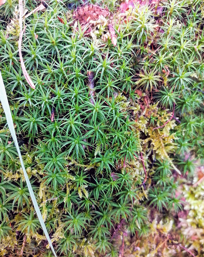
I really like the colours in these two mossy photos. When you look closely enough you don’t just see green but pinks and purples too. If I was smart I’d have a colour generator app on my phone perhaps to make the process faster. I’m sure it must exist?

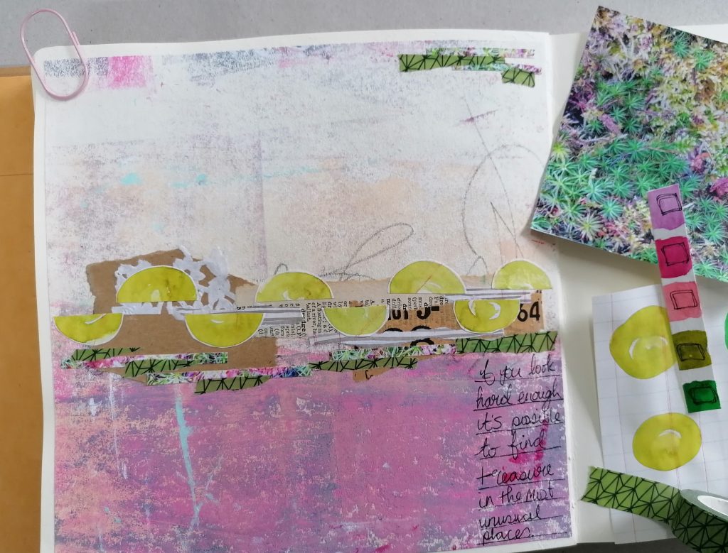
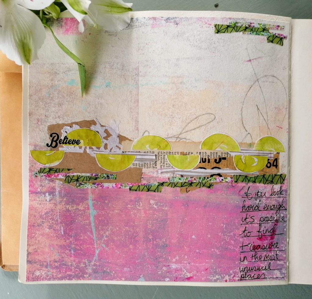
I work abstractly most of the time and the journal page below is an example of how I’ve taken inspiration from the mossy photos above.

I decided to go with more of the pinky purple tones and use the green as accents which is the opposite of the photo. I added my collage of papers, cut some of the photo into thin strips and the washi tape ended up being a perfect match not only in colour but after tearing it up I found it almost looked like the moss, happy accident!

So inspiration is all around you, all you need to do is look.

Have a great weekend

Jaine x