Messy vs tidy

Hello from my studio. It’s Friday erm… now Monday (it’s been one of those weeks), outside is hot and sticky but my basement studio is cool so I’m staying here to create in the shade.

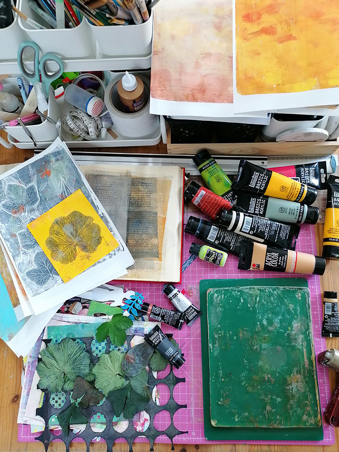
In my studio I’m lucky to have a long artists table. Looking down at it right now I find it interesting that the far end where I do my die cutting, putting cards together and generally anything which needs to be done in a clean, paint free environment, is pristine and the other is messy, chaotic and painty. It’s a bit like my garden, organized chaos I call it. I suppose that’s what comes of being able to leave everything out all the time. I find I work better if I leave the paint and gel plate out all the time as I tend to come and go when I have a few moments. The other end is where I cut my prints and mount them to create backgrounds for cards.
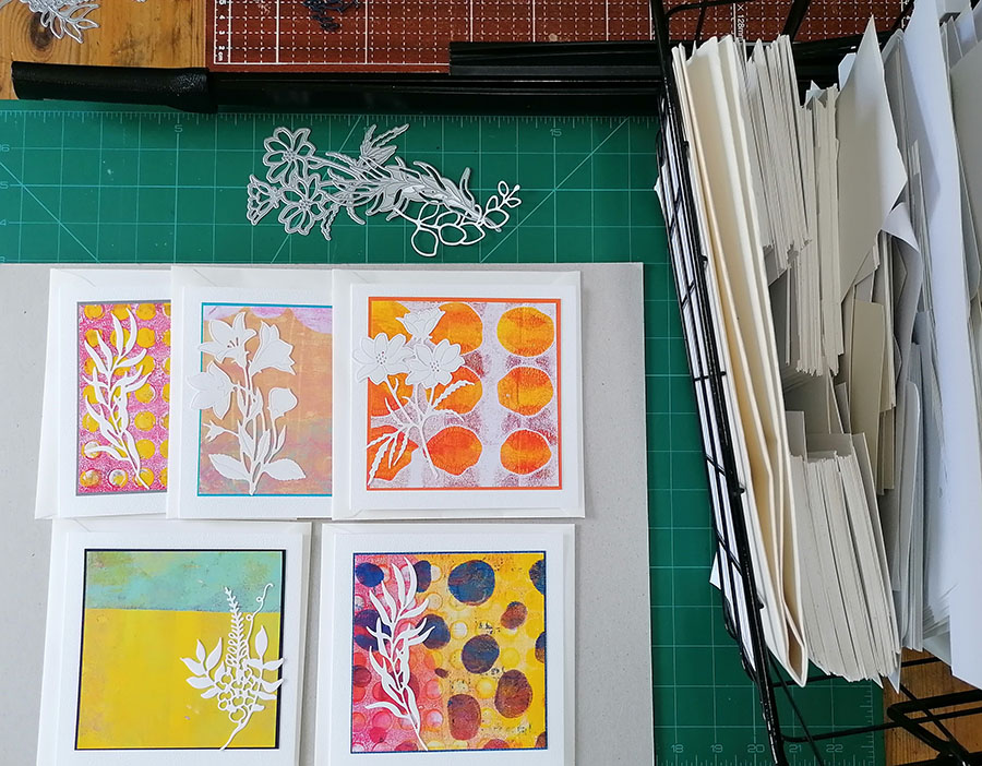
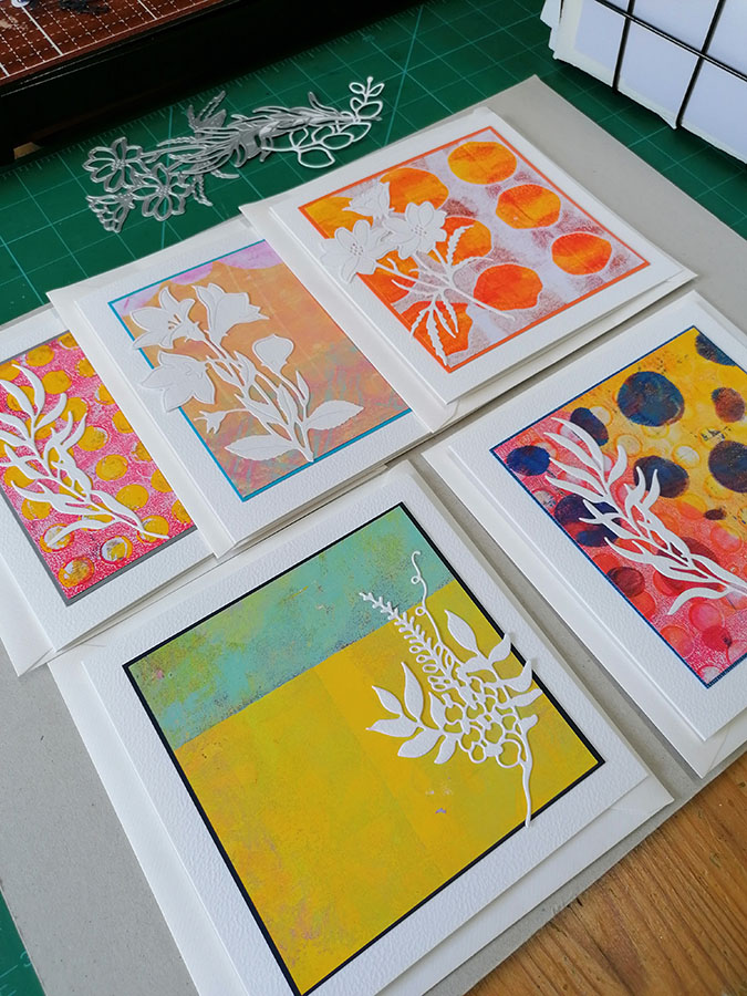
I love the clean look of crisp white card blanks and simple die cuts. From my basket of white card offcuts I cut delicate images which finish off these gel printed backgrounds nicely. They’re like little pieces of abstract art I think. The fun is in creating these printed backgrounds, never knowing quite what I’ll end up with, then cutting them up and layering them on a clean white card base. All they need now is a simple sentiment.
By contrast the other end of the table is where the messy stuff happens. Paint, gel plate and stencils, it’s generally a bit of a mess. Occasionally there’s a fight between the two spaces as I run out of drying room for my prints but so far it’s not been an issue.
These cards are the product of my two sides, the messy mixed media side and the clean, contemporary and simple card side.
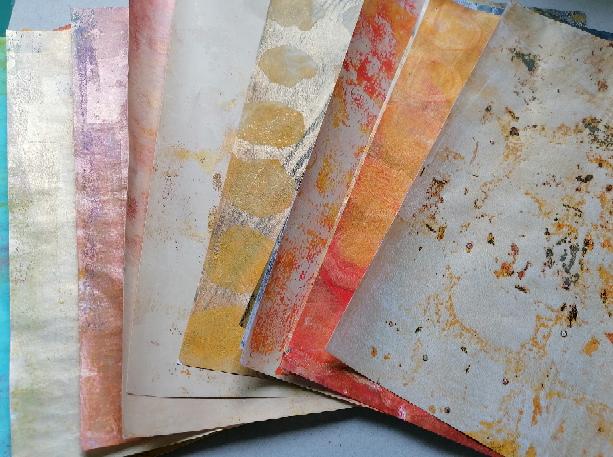
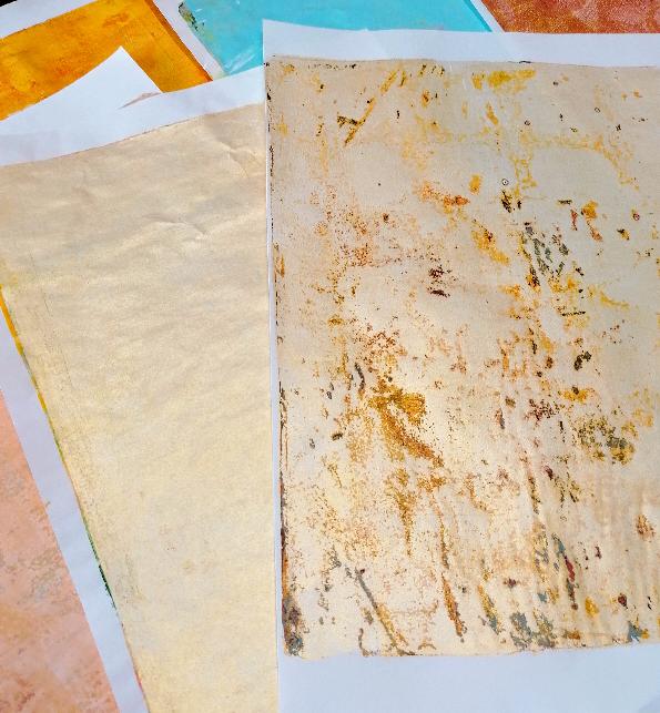
The cool thing is though, my favourite backgrounds are the ones which are simply my gel plate clean off sheets.
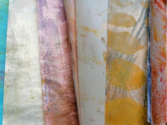
I mean look at this…especially when I use metallic paint to clean off the plate.
Have a good week

Jaine xx
BACK In black

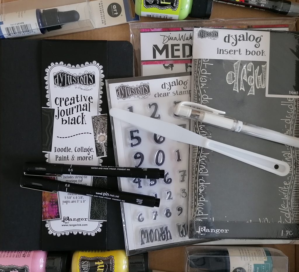
Always looking for a new challenge and something to keep my journaling from becoming stale, I was super excited when Clare from Paper Pen and Plan sent me a couple of black journals to try out and see what I think.

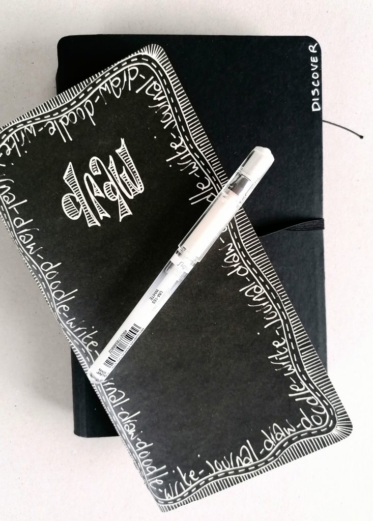
Both are from Dylusions and have thick pages making them both great for any mixed media work.

The challenge is how to fill them and which mediums work best over the dark background paper. It’s surprisingly not as difficult as you might think and the black really does make most paints shine on top.

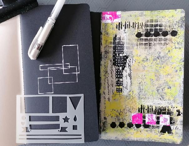
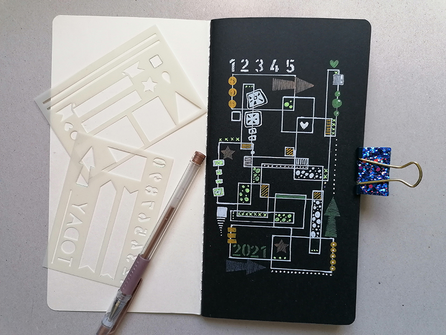
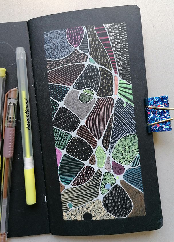
The smaller travelers notebook style journal I decided to use as a doodling notebook, experimenting with different pens on the black pages. The second and bigger of the journals I’m treating as any other journal and loving how it’s working out.

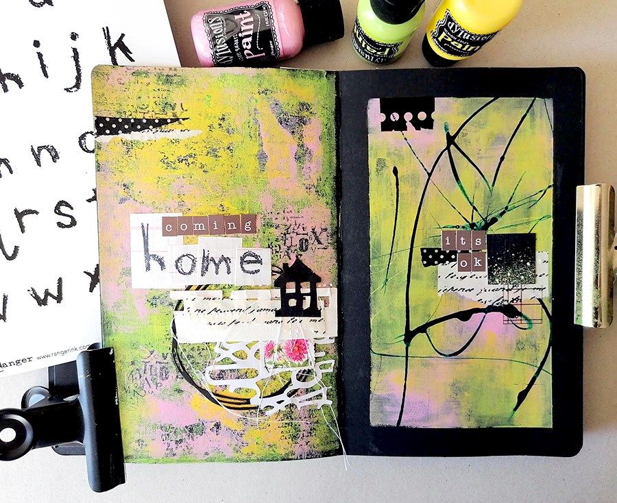
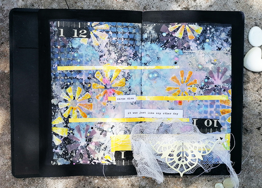
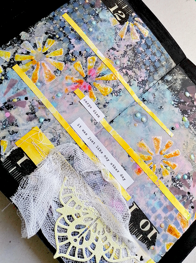
I thought adding a border would make it look neater but actually the page is too narrow for that and the artwork just looked a bit squashed. The only way to make the border work is by creating a double page spread, so that’s exactly what I did here. I have to admit though to going back around the edge with black gesso once I’d pulled off the tape. For some reason I want to keep the black journal clean. A double page spread is definitely the better way to go.

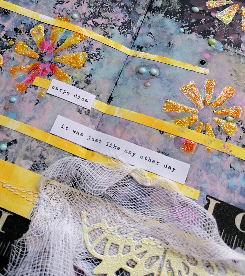
The little collage was pre sewn before being stuck down to the page and adding a bit of black washi tape is an unexpected addition. So far I’ve been using acrylic paints on the pages so I thought I’d try something else. Distress Oxide inks are a bit different and work well on dark backgrounds. I used both the reinkers and the ink pads but found the ink pads got a bit lost. The page needed lifting somewhat so I added some stenciling with white gesso which I also went back over with Stickles.

The doodling journal is much cleaner, fits nicely in my bag with a couple of pens and looks neat with stencils too. These are the stencils I designed for Paper Pen and Plan to go with the Sweet Treat boxes, I love them.

Gel pens, especially metallic ones look fab on a black background, and a white Posca pen goes brilliantly around the edges of the design.

I enjoy using the black journals for a change and discovering which mediums work best on the pages.

The black Dylusions journals can be found at Paper Pen and Plan on Etsy

Have a lovely week

Jaine xxxx

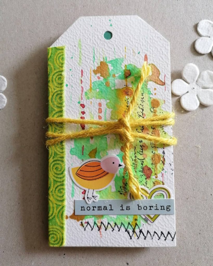
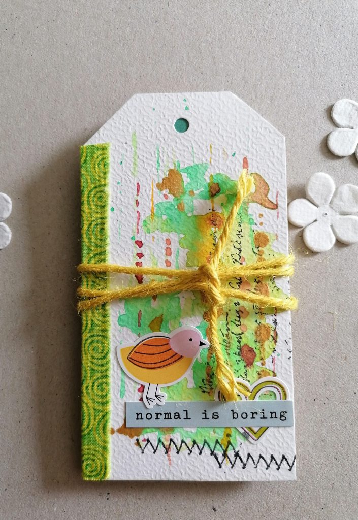
normal is boring

Normal can be a blessing after a period of upset and stress, however just doing one little thing out of the ordinary every now and then peps life up and keeps things from becoming stale. Well that’s my excuse for straying a bit away from the norm sometimes.

I’m back in the studio after a period away and very keen to get the paints and pens out again. I find comfort in these things and just having my supplies around me brings me joy. I also think that starting in a small way is easier than trying to complete a big project right from the get-go! This is why I was pleased to see a couple of tags in this month’s Sweet Treat Box from Paper Pen and Plan and a challenge to create a tag book with them.

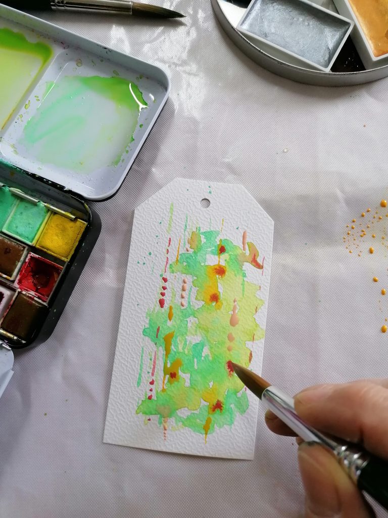
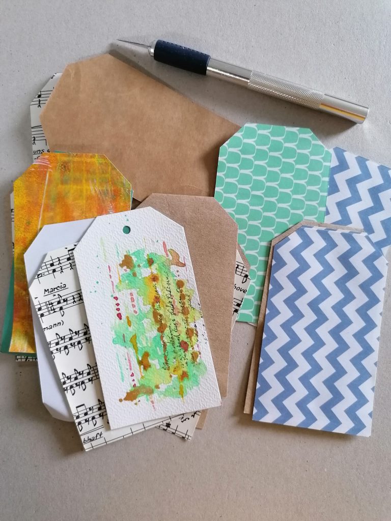
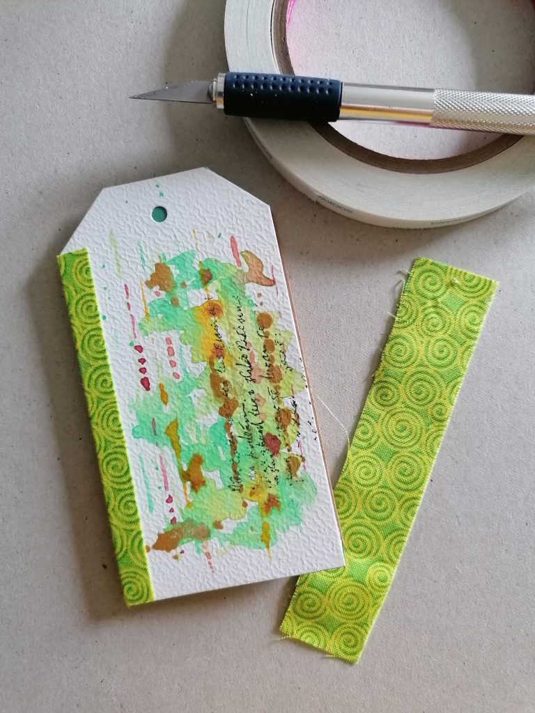
Without a clear plan of what I would end up doing, I decided to start with a little abstract watercolour on the tags using a lovely gold watercolour paint I bought recently and hadn’t yet tried out.

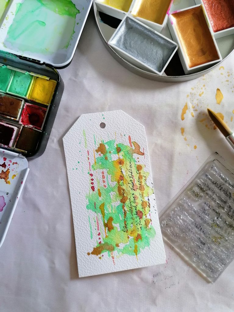
A Prima text stamp added a bit of contrast and extra texture. The lines just happened naturally which I was surprised about to be honest as I usually go for circles, anyway it was quite appropriate that the text should also be placed that way on too.

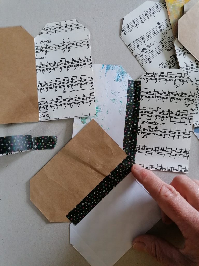
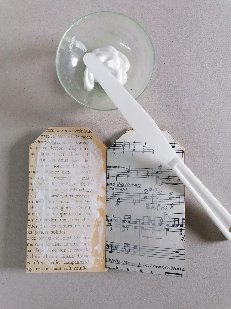
Using the tag as a template I cut several more from odd bits of paper, brown paper, bags, book pages and gel prints.

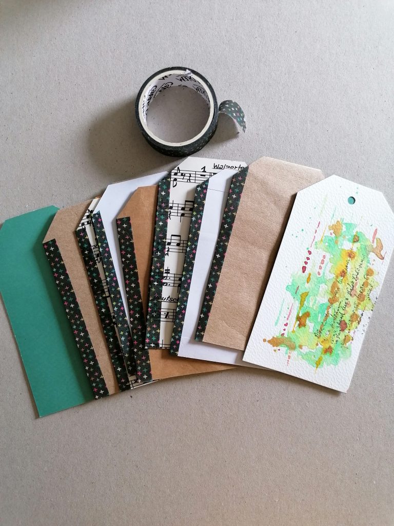
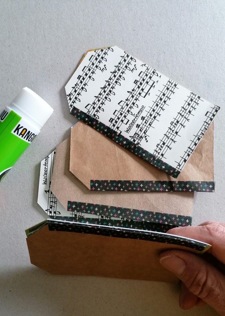
I’ve seen this binding method in several places recently and it seemed like the most simple way to bind the pages together. Handily the box also came with the washi tape so of course it was obvious I’d use it here. I taped the pages together in pairs.

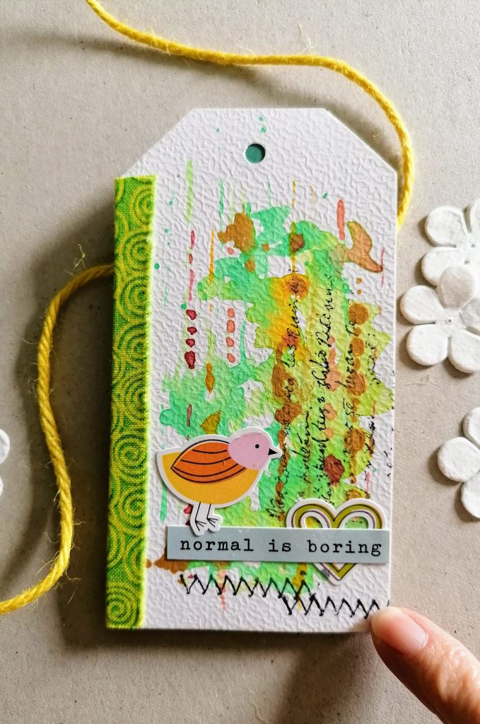
Then glued the pairs together back to back. A strip of fabric covered the spine and added a pretty bright splash of colour to the front too.

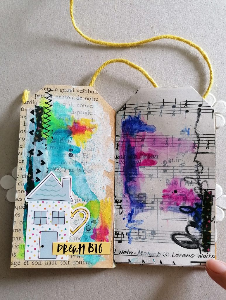
It just took a stitch stamp and a couple of stickers (also in the same box) to finish the front. I added a thin smear of gesso to the pages so I could add paint to them and tested out the first page with a few watersoluble crayons and more stickers. Anything but boring I think.

I hope you have a lovely weekend and I’d love to know what you’re up to as well.

Jaine xx

introducing the Micro Photo album

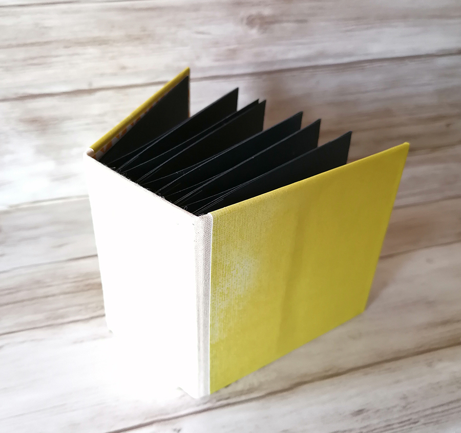
I’ve discovered that in fact the smallest of the interactive album family is the most fun to put together and my personal favourite.

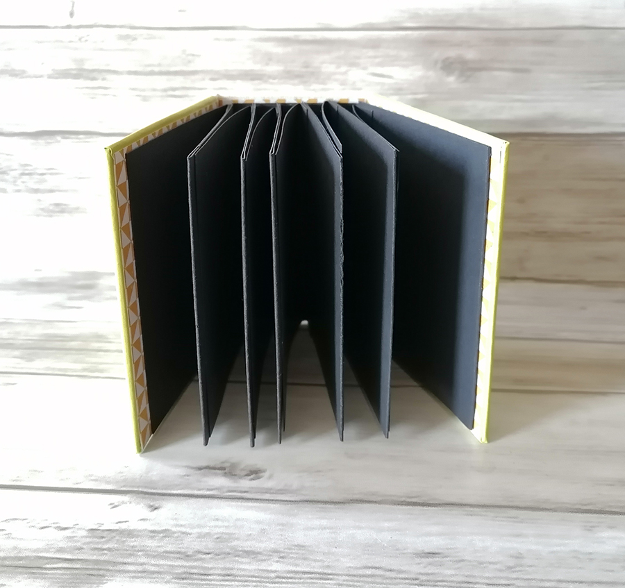
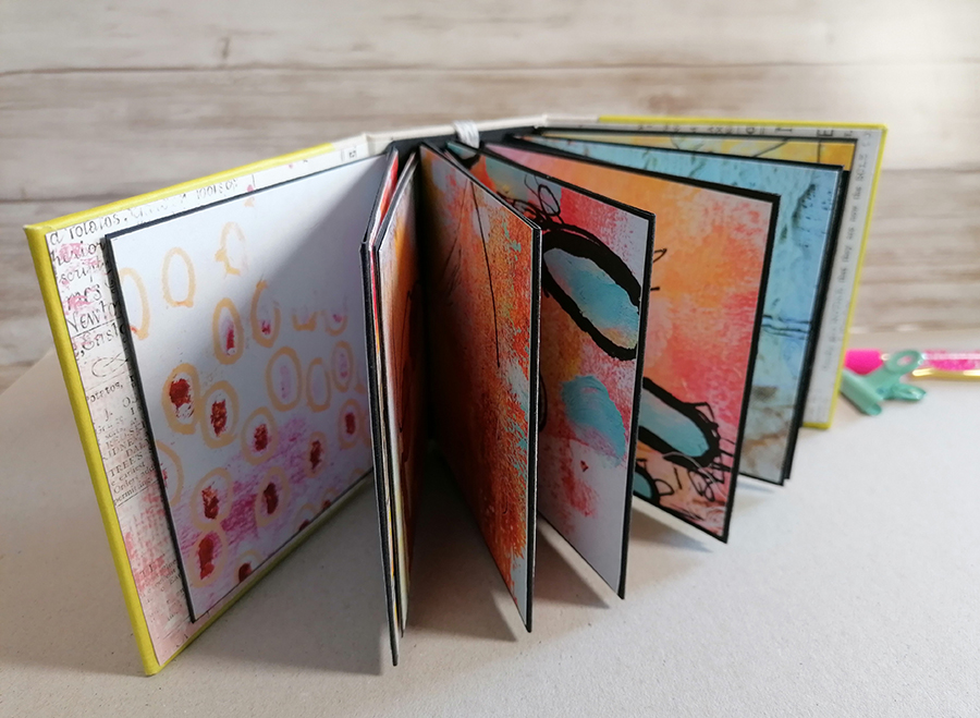
It measures 10x10x6cm’s so is small but chunky. It sits on a shelf perfectly due to the wide spine but don’t be fooled by the size. It has 24 square pages giving you plenty of room for photos and perhaps some text. I like to use black as the base because it makes any colour on top really pop!

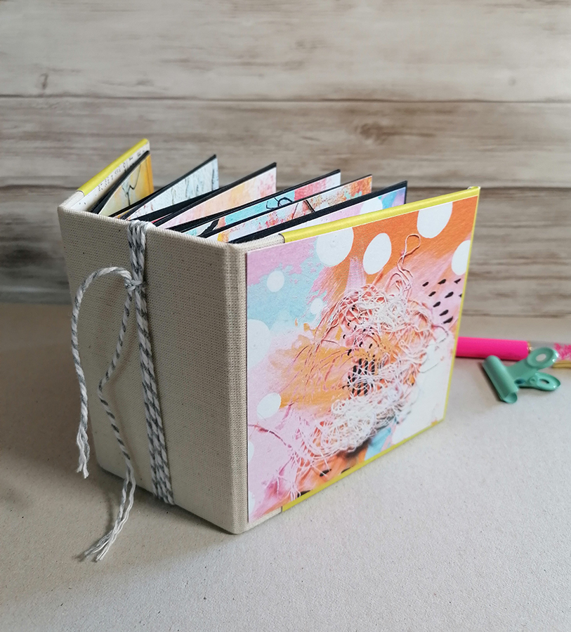
This little chunky has been filled with arty/mixed media designer papers and to be truthful it’s so cute it would be a shame to cover them up with anything else!

It’s so colourful, full of fun and definitely quirky.

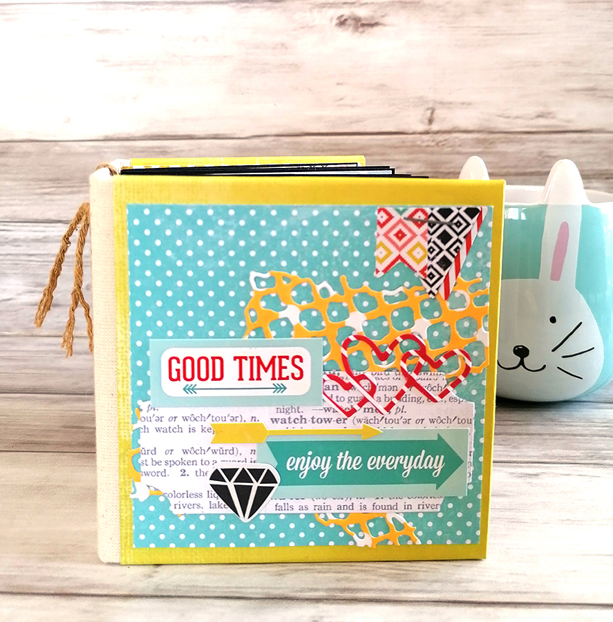
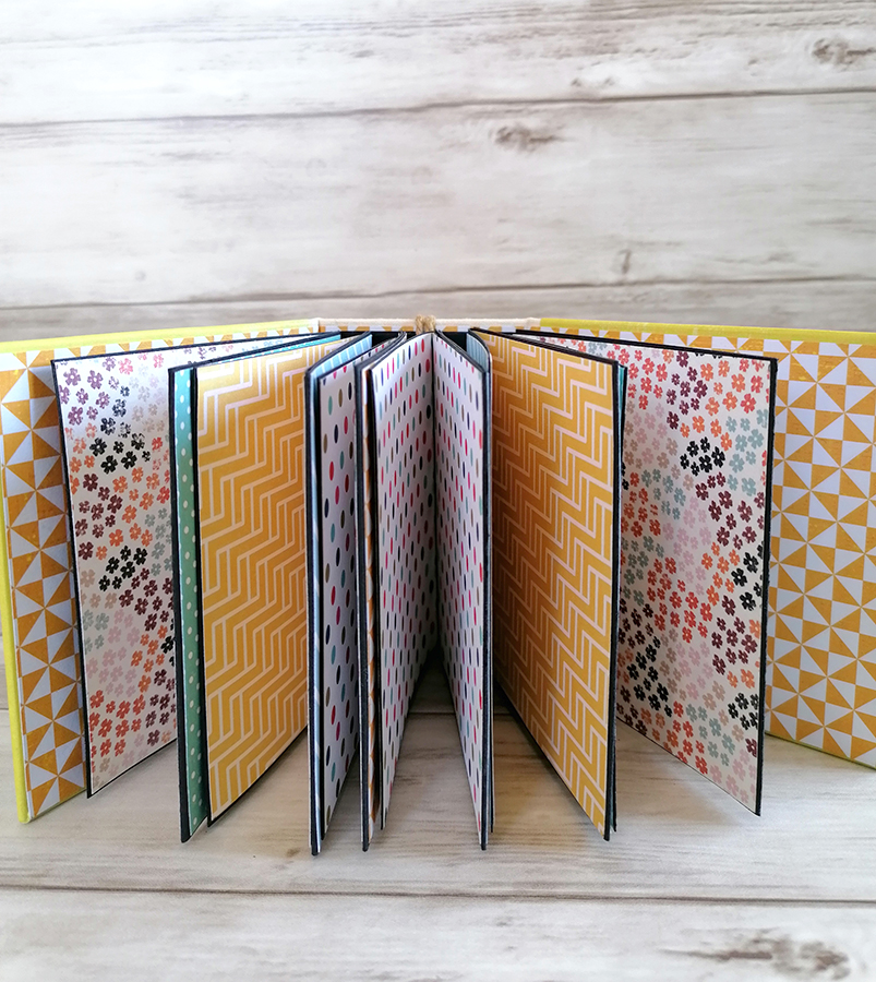
This next one is equally as colourful but in a much more controlled, scrapbook style.

Mostly yellows, orange and dusty blue shades, it has a more graphic style.

Both have twine around the spine which can be used to hang a small charm so lots of opportunity to make this even more personal.

Both these finished albums are in my Letzshop store here and to have a bespoke micro album made just visit my shop here. At just 30€ they would make a wonderful and personal gift for someone either to fill with photos or already filled with memories.

Have a good weekend

Jaine xxxx